CORP MARKETING
2025 - present
brand materials & graphic design
Students of Georgetown, Inc. (The Corp) is Georgetown University's entirely student-run nonprofit operating six coffee and convenience stores across campus. As a philanthropic organization driven by the mission of “students serving students,” The Corp gives back to the Georgetown and DC communities by funding scholarships for students and initiating partnerships with local philanthropies. Members of The Corp’s internal Marketing Department produce all creative materials promoting The Corp and its philanthropic initiatives—ranging from social media content to physical posters to chalkboard displays.
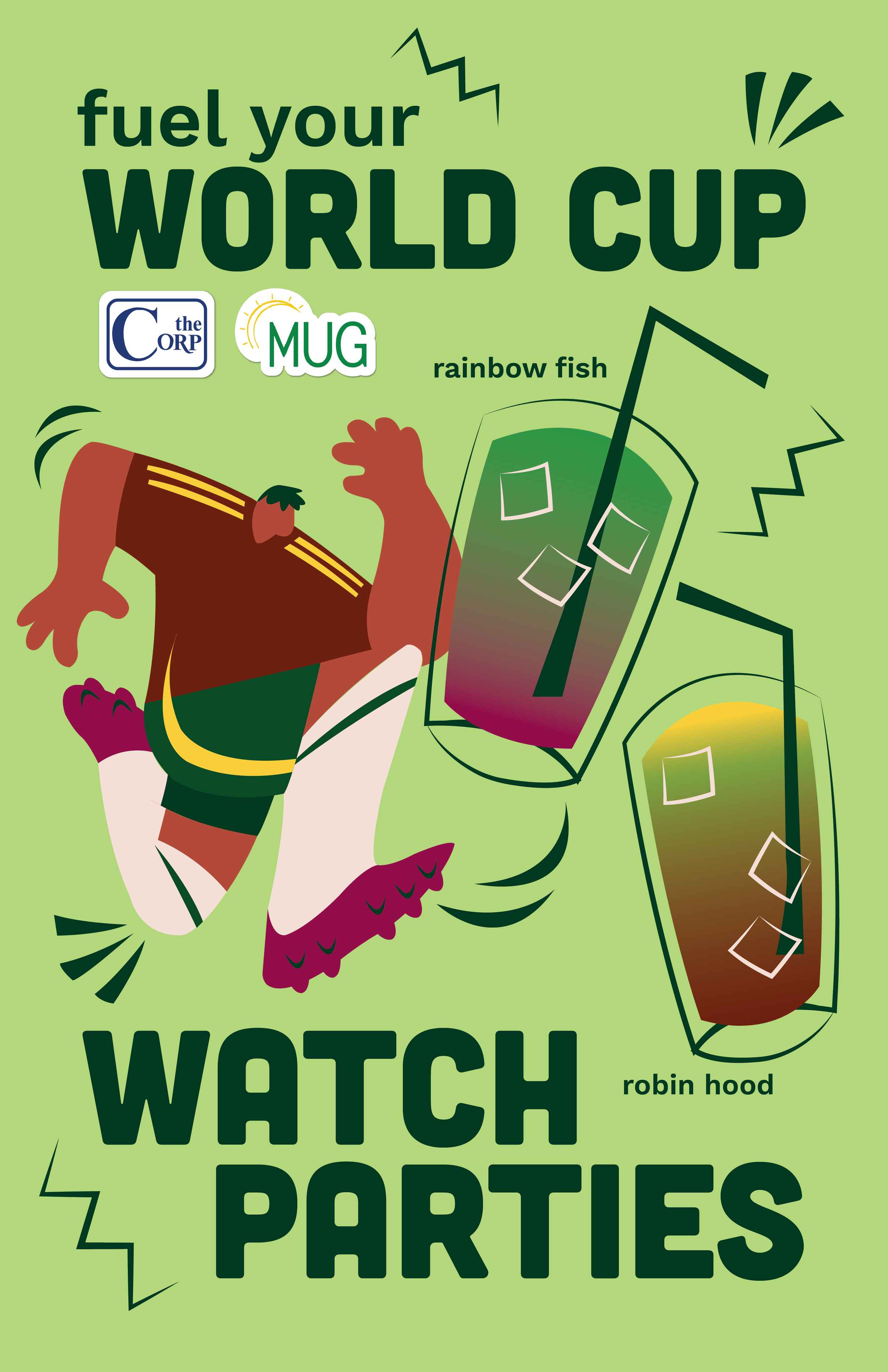



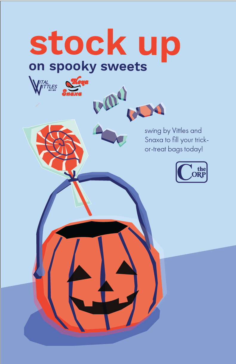
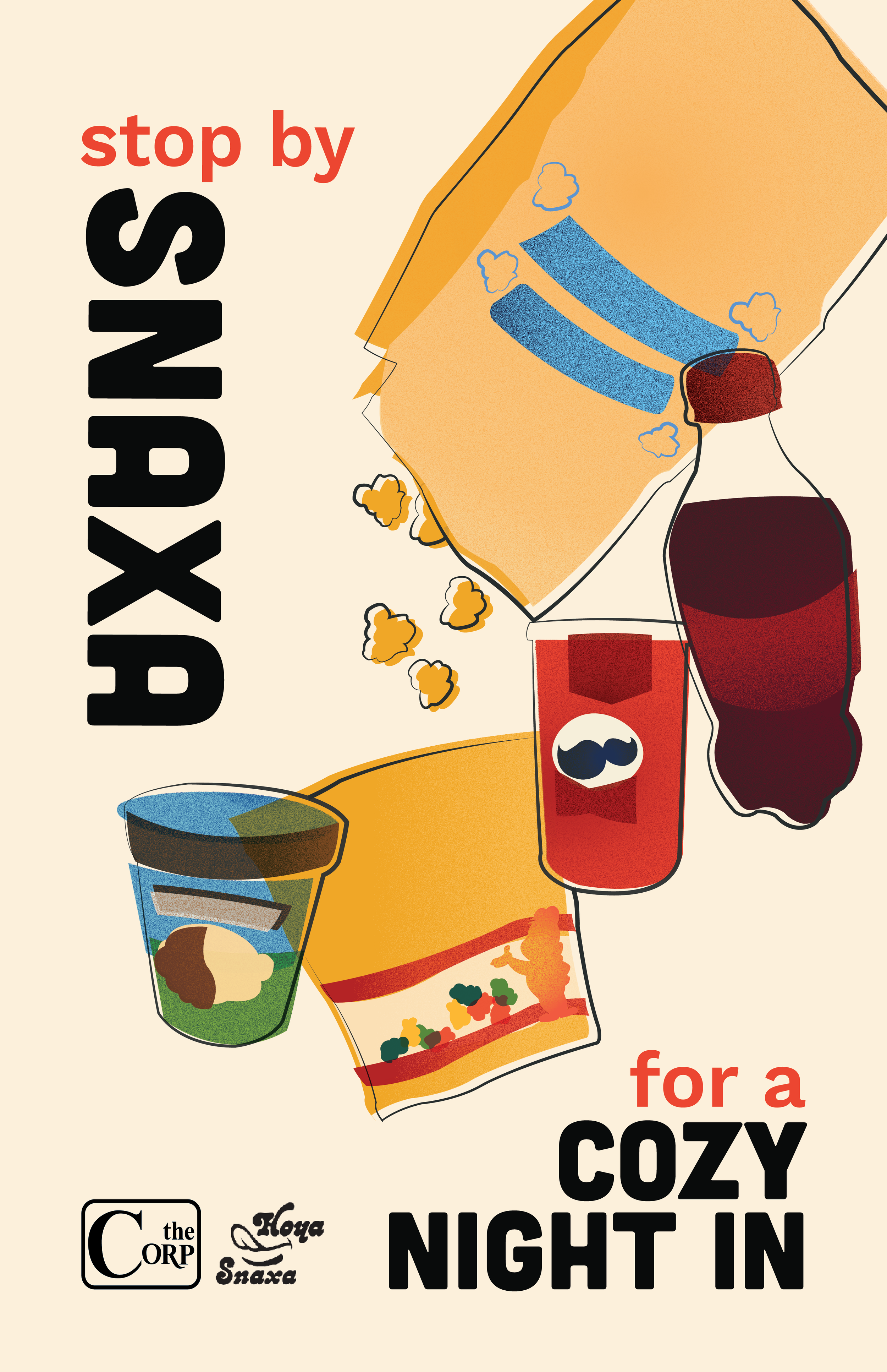

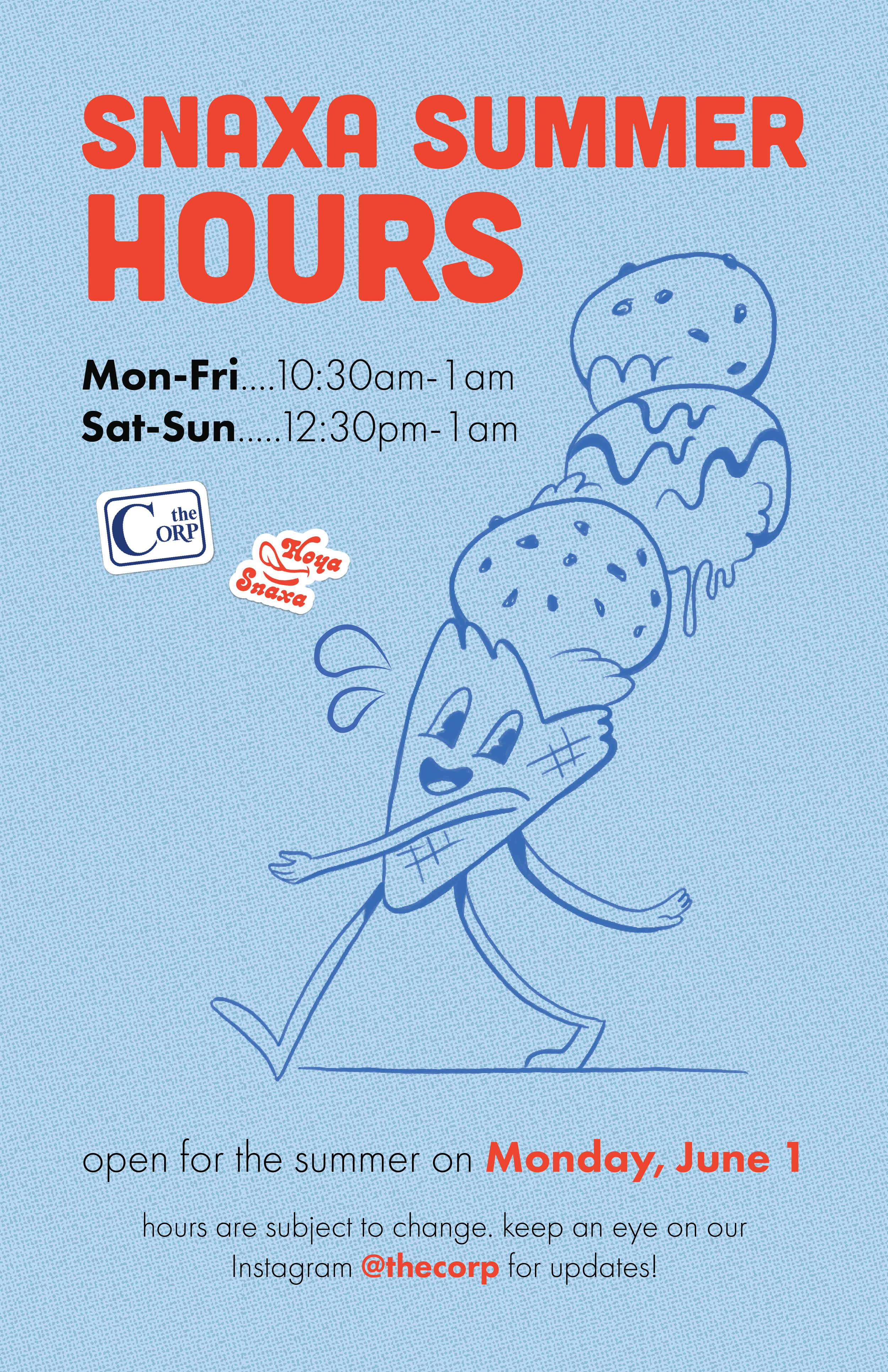
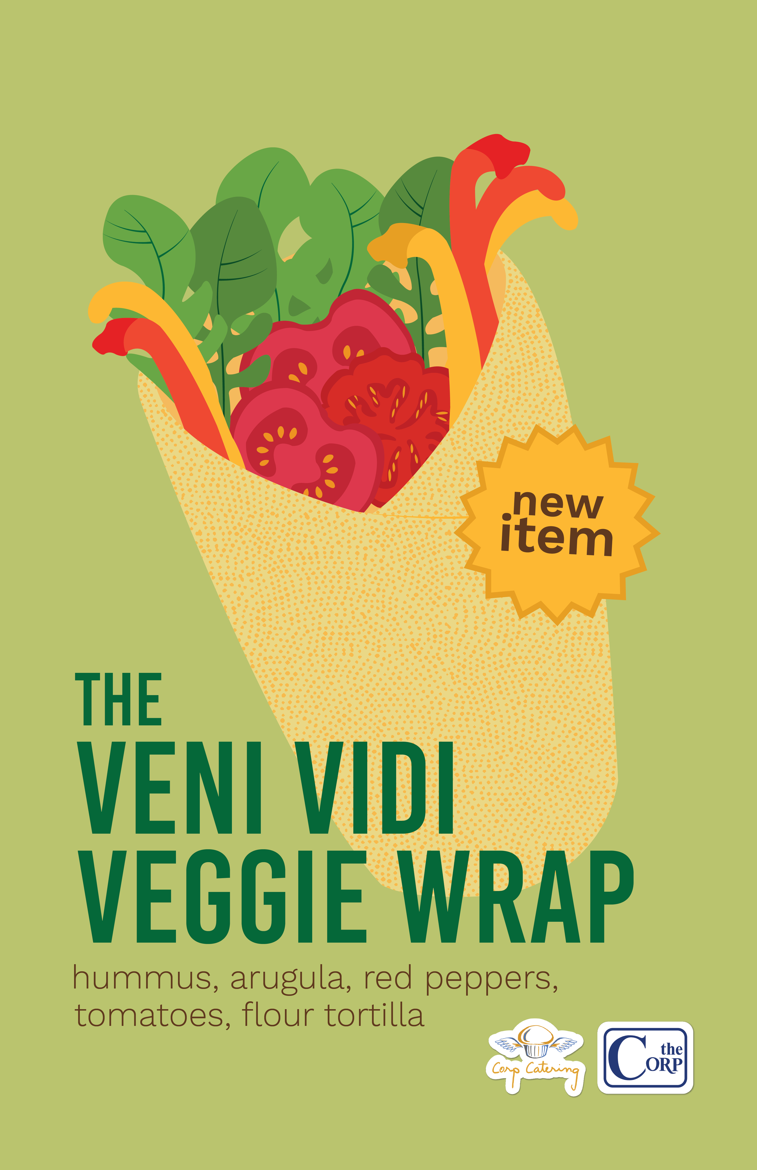


SIGNAGE
2026
chalk markers on blackboard
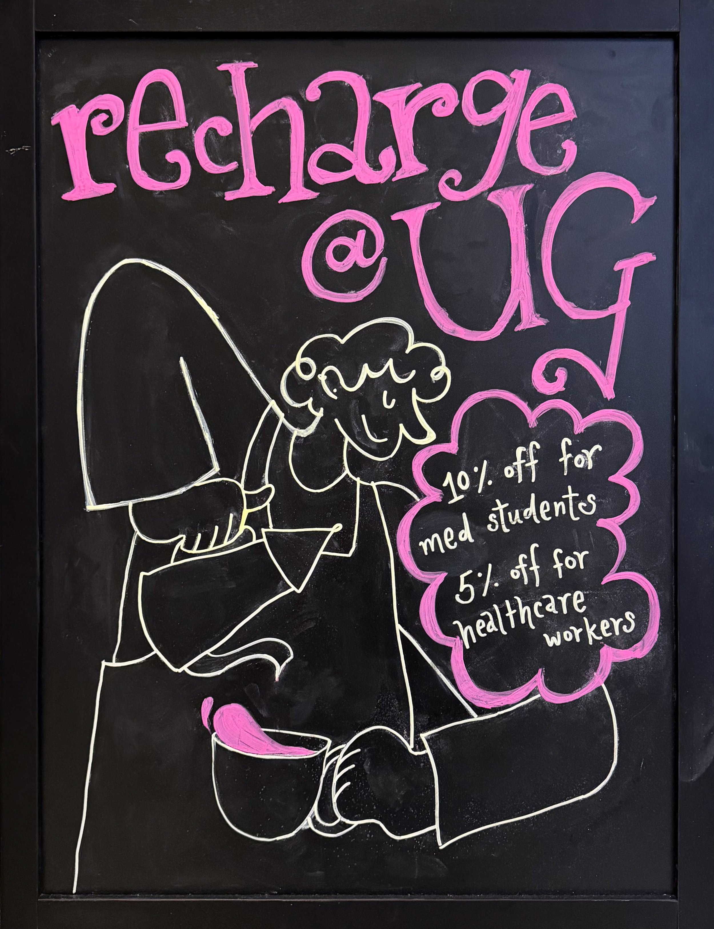
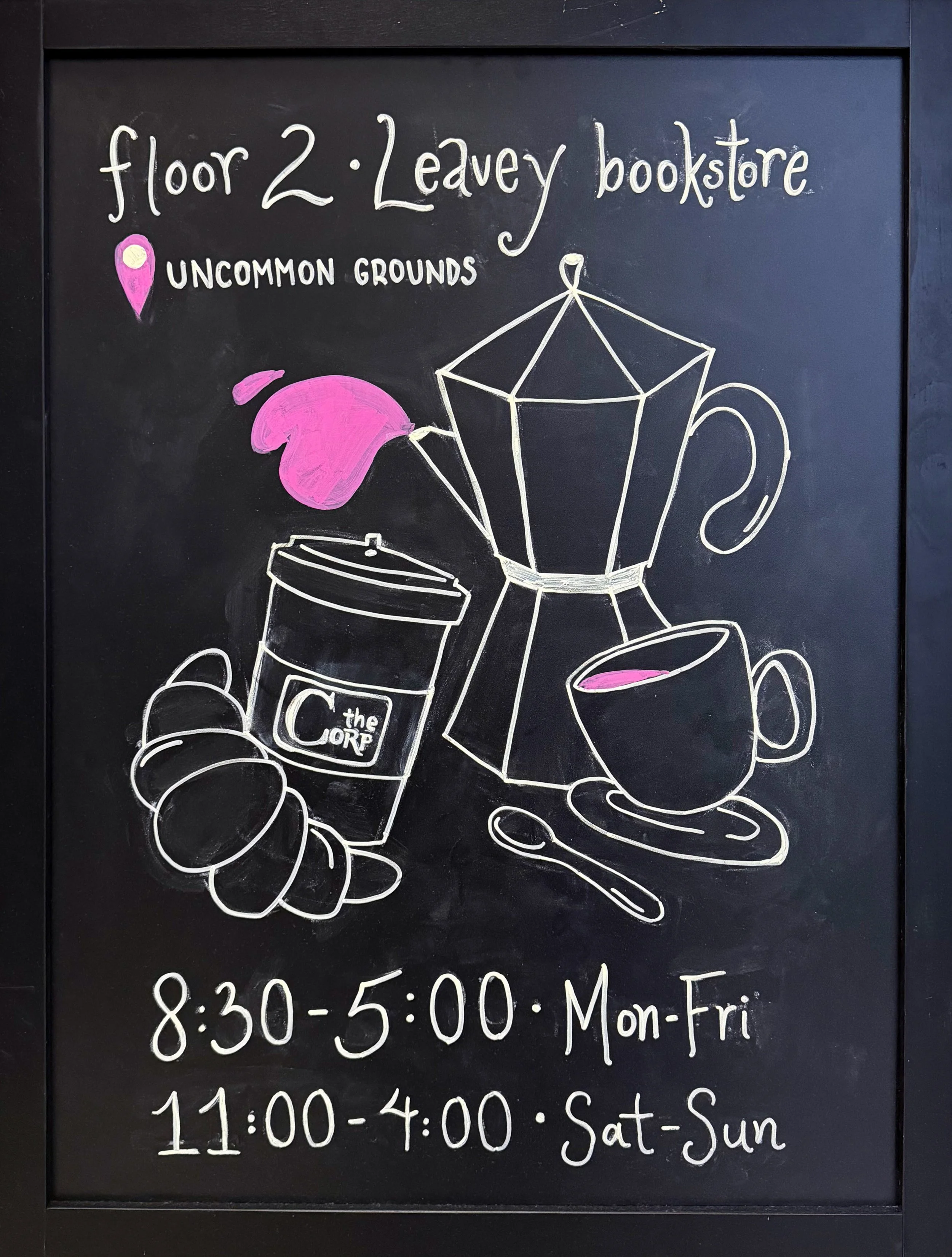
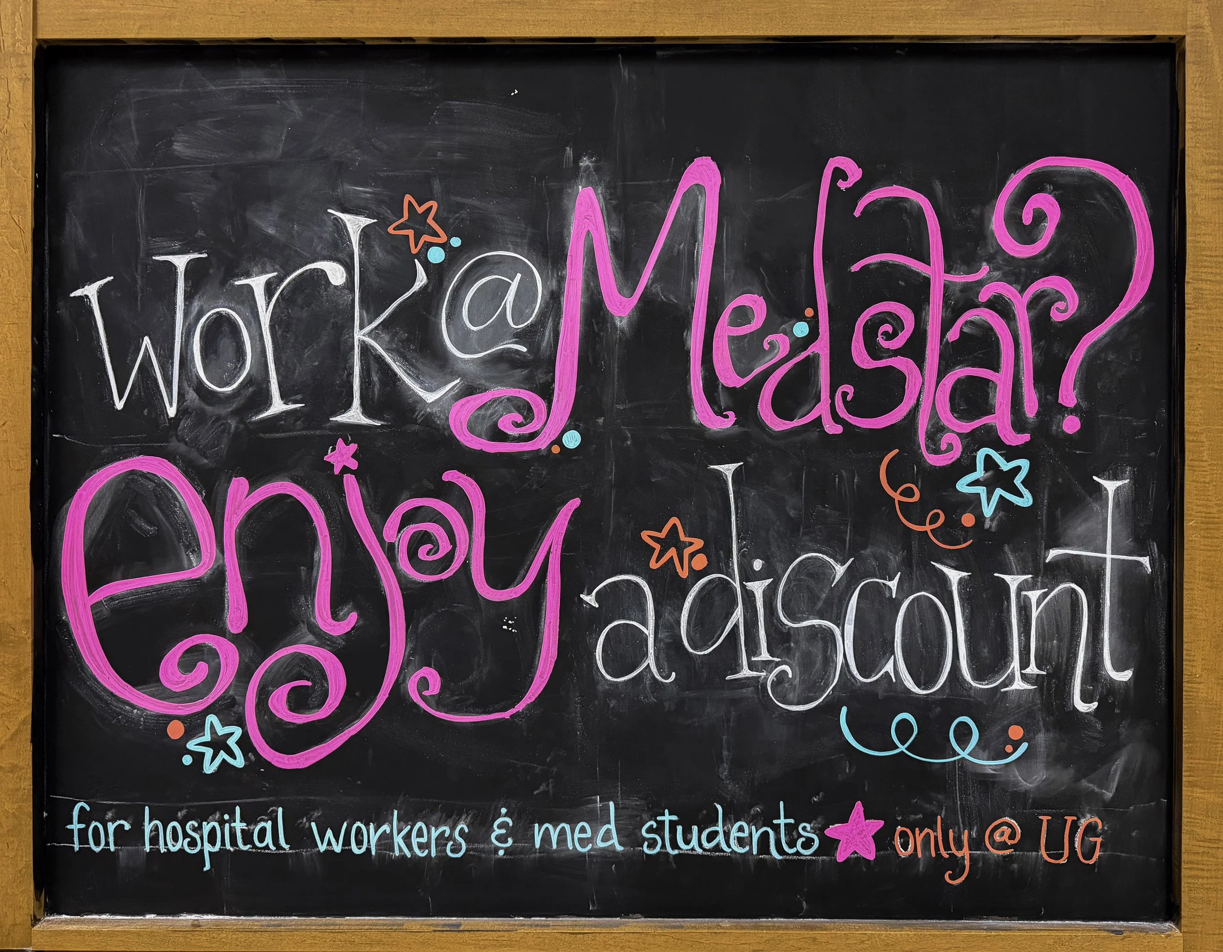
Chalk signs and A-frames advertising Corp locations throughout campus, from cafes to convenience stores.
CORP STORAGE
2026
promotional campaign for summer storage initiative
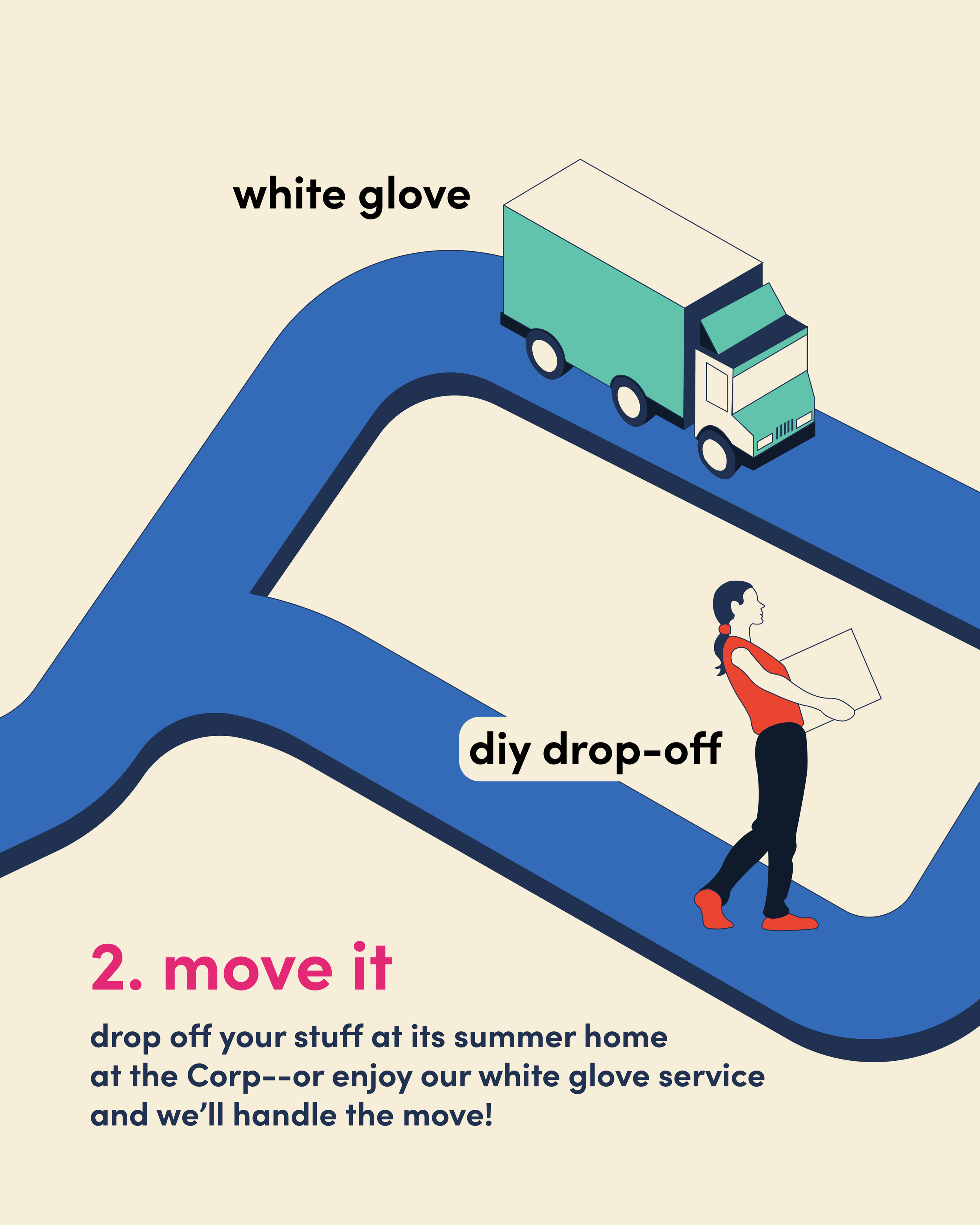
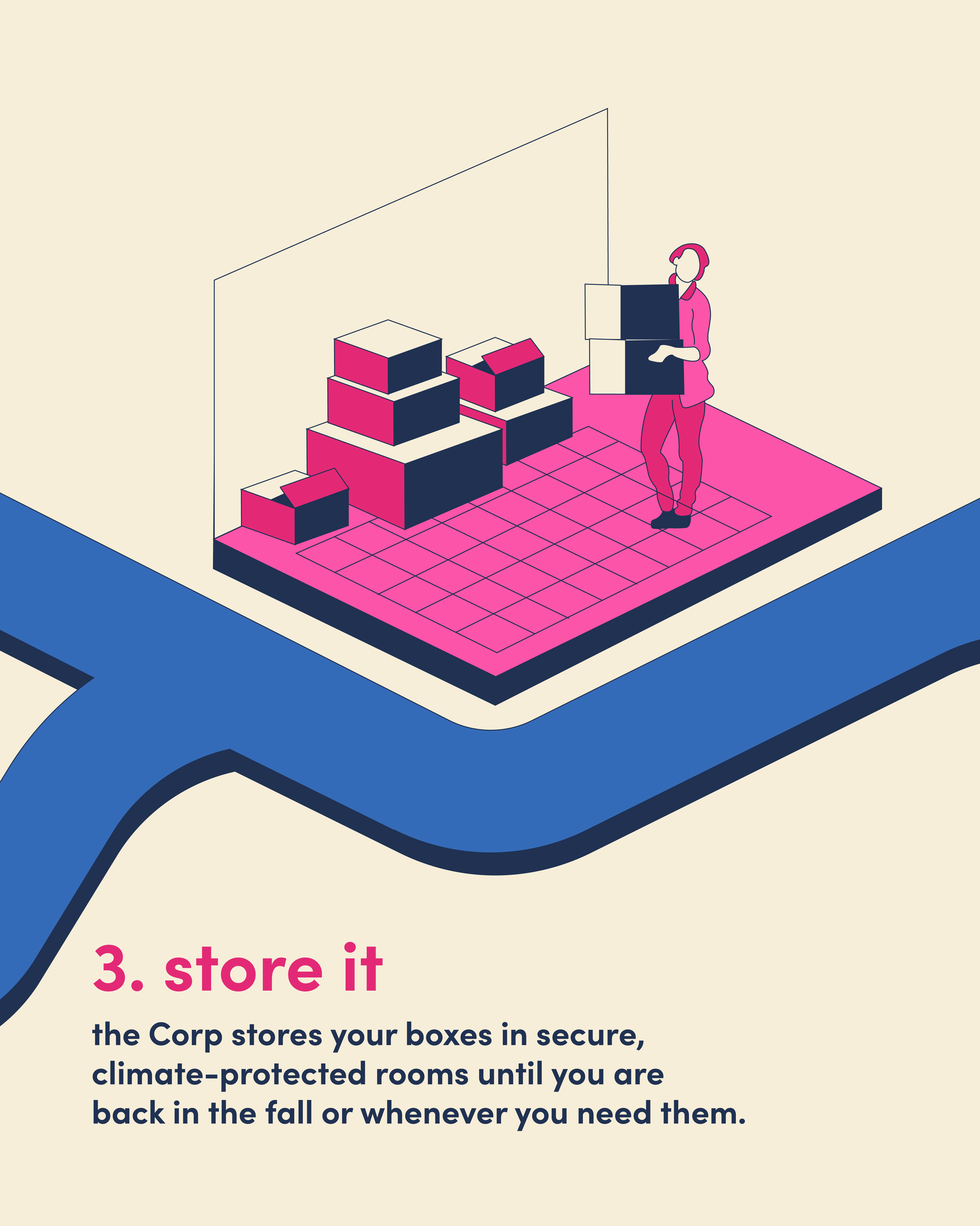
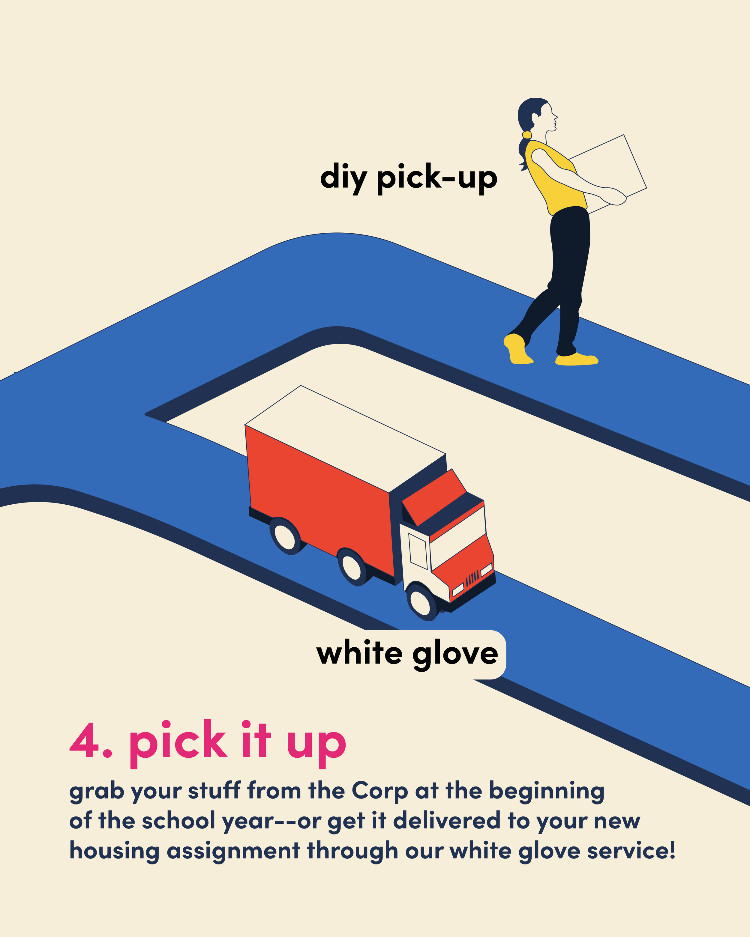
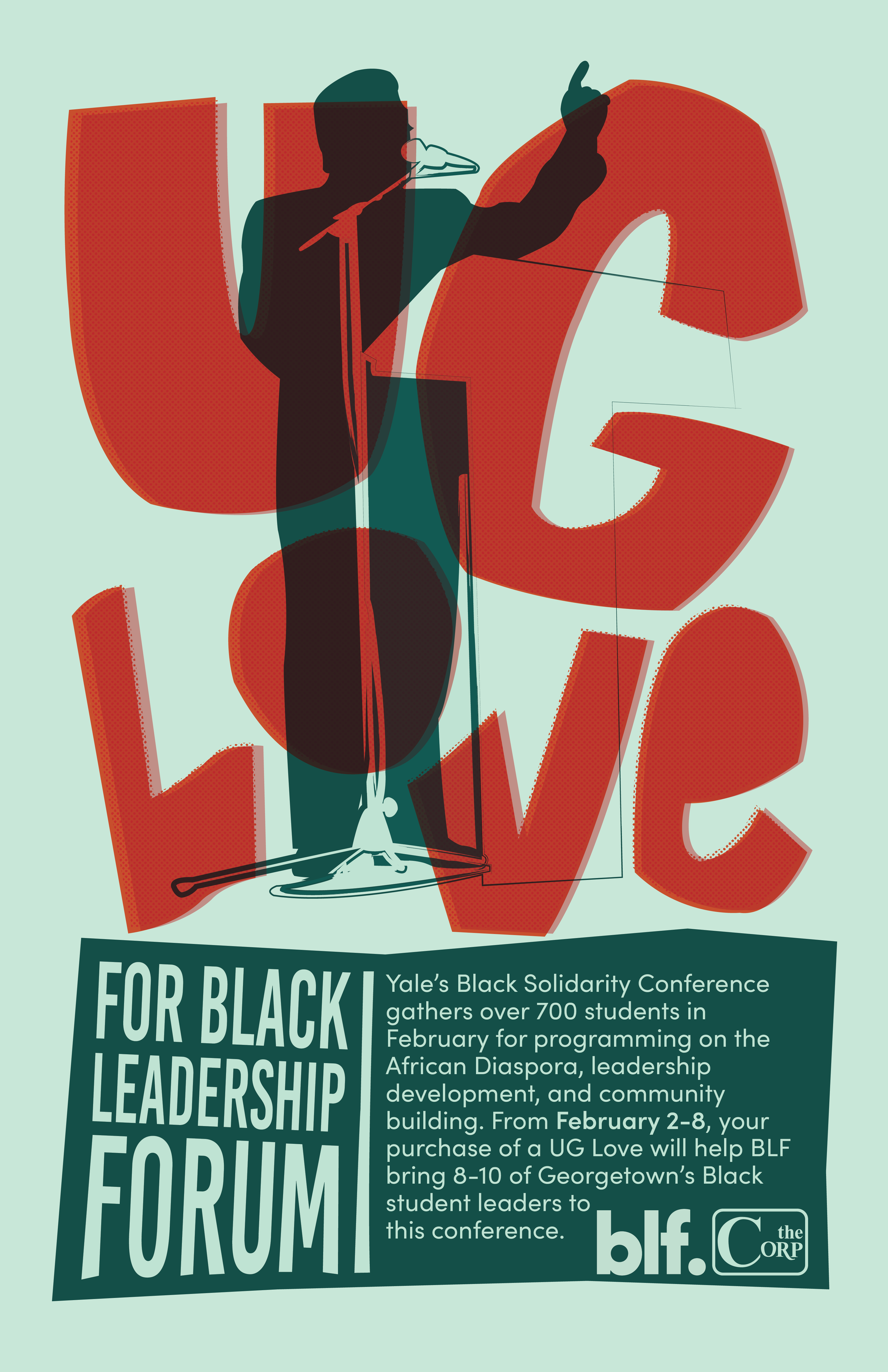
Every spring, The Corp provides storage options to students looking to store their belongings on campus for the summer. My informational graphic advertising The Corp’s Summer 2026 Storage campaign, which was featured on The Corp’s website and Instagram, contributed to an outreach initiative that generated three times the sales of the previous summer.
PROCESS
brainstorming + ideation
I created an infographic explaining Corp Storage’s services and the offerings customers could choose at different steps of the storage process.
While brainstorming, I focused on the infographic’s purpose: to outline the steps of Corp Storage, presenting The Corp as a streamlined, hassle-free summer storage option. To do so, I used a vector of a road to show each step seamlessly transitioning to the next—a design that worked as a four-slide Instagram post and as a single image on the Corp Storage website.
FINAL DELIVERABLE
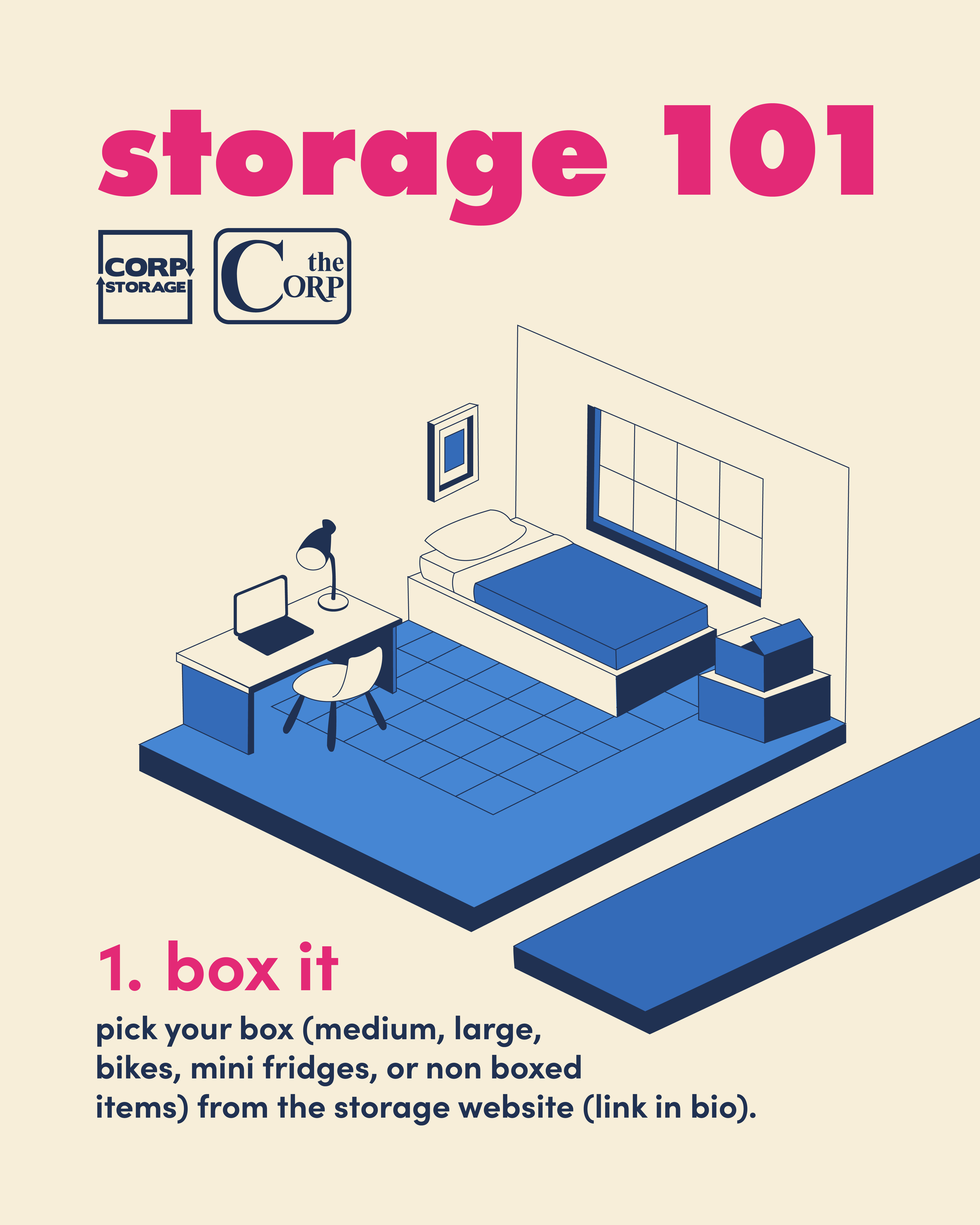
iterations
I followed the Corp Storage brandbook to select colors and fonts, toggling between different color choices before finalizing the infographic.
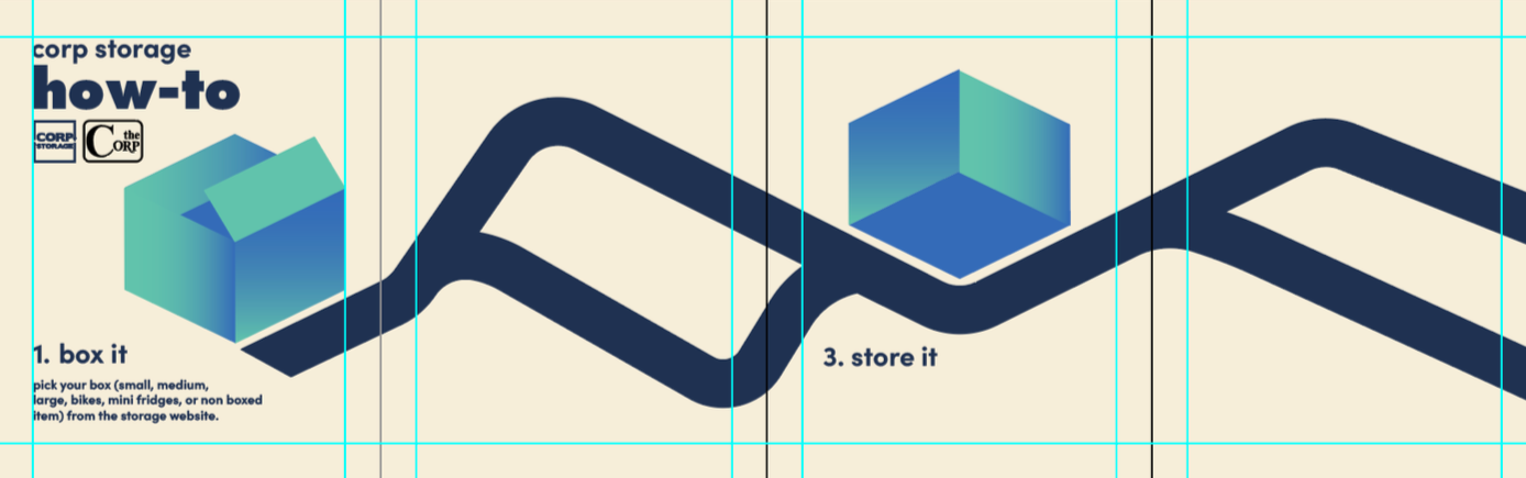
I started by using gradients to color the boxes representing the steps of the storage process, then realized that drawing detailed vectors over a complicated color background would look convoluted, not clear.
My next attempt used monochromatic vectors, but using many variations of the brandbook colors left them looking washed out.
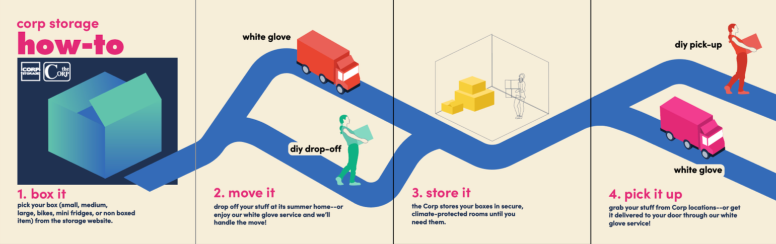
The final design includes fewer color variations to maintain simplicity, using navy and beige for shadows and highlights to create a cohesive design that outlines a multi-step process.